Does signage ultimately reduce accidents? This is a fundamental question; however, to arrive at an accurate answer, it's important to know how to measure the effectiveness of signage.
For signage to be effective, it is essential to create a good map of the locations where hazard warnings should be placed. These warnings should be presented in a simple and clear way so that people can quickly understand how to protect themselves in a given environment.
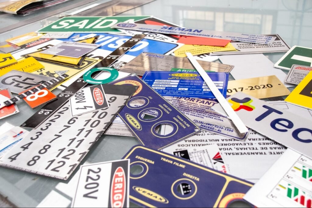
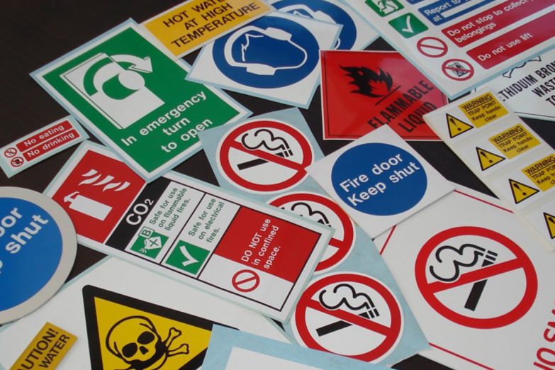
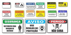
Regarding the methods of application, they should use already known signs and illustrations (drawings), grouping them coherently, keeping employees aware of the alerts with sounds, tapes, chains, cones, signs, posters, among others.
When these factors are taken into account, the role of signage becomes very relevant, with its greatest indicator being the absence of risks and accidents in environments with people circulating, whether in public or industrial areas.
This is a broad topic full of details. One of them concerns the use of colors in environments.
There is a specific standard that regulates colors. NR 26 establishes the standardization of how to communicate preventive measures to workers.
These are universal rules, independent of the company; however, the strategy for display locations should be specific.
Regarding colors, it's worth keeping the theme up to date:
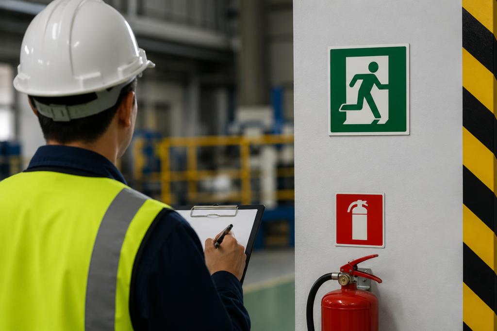
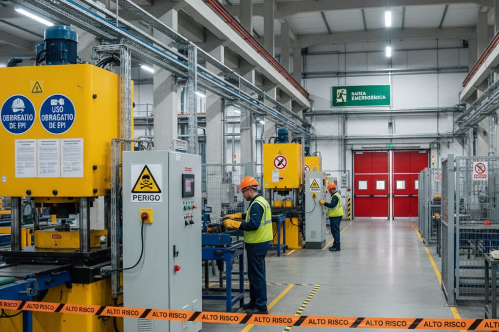
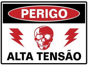
The color red reminds us of fire fighting and extinguishing equipment. The color red is used for fire fighting equipment, alarms on barricades, building fences, and other temporary barriers. Emergency stop circuit breaker buttons are also part of this scope.
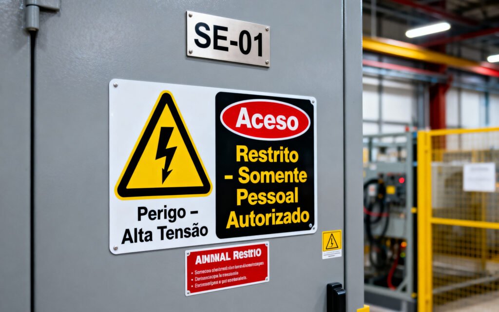
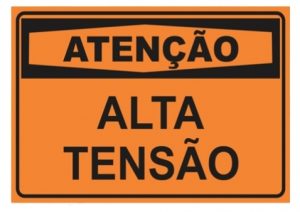
It's interesting to note that the color yellow is used as a danger signal. Red is less visible compared to yellow and orange. For this reason, these two colors have alarm significance.
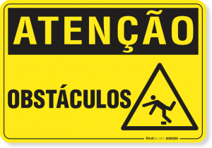
More specifically, yellow is used to indicate caution, warning of the risks of tripping, hitting one's head, and accidents involving mobile equipment and vehicles.
Boxes and squares with a yellow background are typically used to improve the visibility of signage.
White is used in safety zones, such as walkways. It is also used on trash cans and drinking fountains. In the case of delineating rescue areas, the color white is used by firefighters and on other rescue equipment, storage facilities, and safety zones.
The color black is applied to highly viscous and flammable fuel lines, such as...
asphalt, fuel oil, lubricating oil, resin, etc.
Green, on the other hand, is the color of safety and is used on rescue equipment boxes, gas mask boxes, water pipes, emergency showers, stretchers, eyewash stations, oxygen hoses, and other safety devices.
Because it is more visible, orange is used on tubes containing acids, the interiors of machines and protective covers that can be opened or removed, on moving parts of machines and equipment, the interiors of protective boxes for electrical devices, the exteriors of pulleys and gears, safety triggers, cutting devices, edge cutters, and presses.
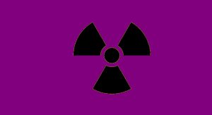
This color indicates the danger of penetration of electromagnetic radiation from nuclear particles. It should be used, for example, on the doors of places where radioactive materials are stored.
Light gray is used for vacuum lines and dark gray for driving lines.
Finally, the use of colors is essential for the rapid identification of certain chemicals in pipelines, allowing for a timely response to emergencies.
Discover Cooperaras' safety signage solutions and avoid risks and accidents in your company.